Introduction
This was inspired by a recent job challenge in a company that needed a Product Designer. I choose not to name the company because it’s simply unnecessary. Sadly didn’t get the role but that birthed this short article.
Let's get right to it.
Taking into account one of the famous UX laws, Jacob’s law which illustrates:
“Users spend most of their time on other sites. This means that users prefer your site to work the same way as all the other sites they already know.”
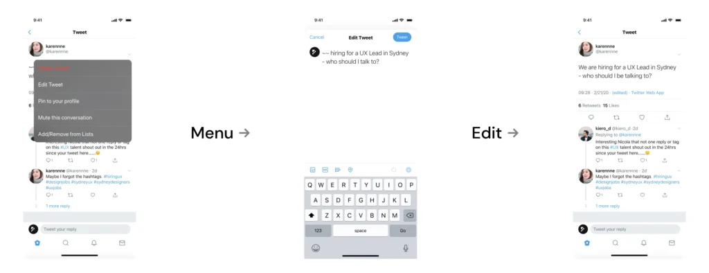
So we will look for similar patterns that have worked on other websites. Platforms like Twitter are heavy on conversations(conversation driven) so we should not take that away. We also need to limit the number of times users can edit a tweet. I’m thinking one, this limits abuse and if we’re considering resources I’ll say server use; servers are expensive.
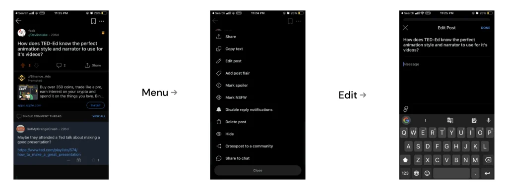
Another platform famously known for it’s conversational nature is Reddit, so let’s remember the law we stated earlier and see how they did it.

Now let's do ours(but better.)
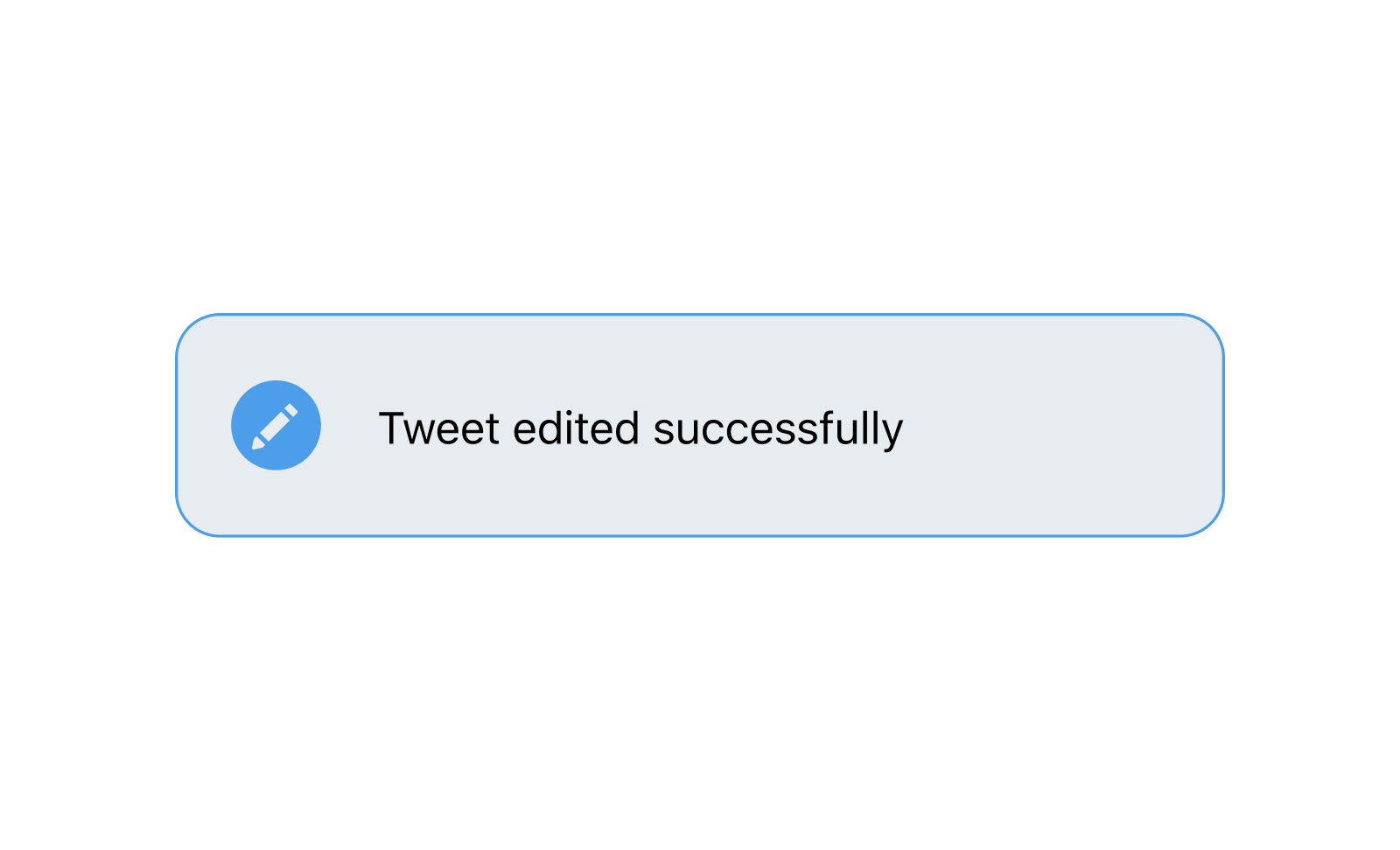
With Twitter editing, a tweet can be more than just editing a spelling error; if a tweet is deleted it can change the context and meaning of the entire conversation and that is a slippery slope. We need to let new visitors to the conversation know that the tweet has been edited. So we introduce two things: an edit tag and a timeline. A tag to let users know the tweet has been edited and a timeline to show the original tweet and the edited version. On tapping the “edited” tag, we then get to see a timeline of the tweet.
We’ll skip the wireframing to save time, seeing as we already have a vivid idea of what we want to achieve. Let’s remember another UX law which is the 3-click rule before we get into this, this law is part of the universal rule of three further reading can be done here. We also have the assets to go straight to High Fidelity:

And now, the prototype to get the feel of it
And there we have it!!!
Other things to consider:
The edit function may be limited to the original tweet and not extend to replies; this decision requires more research and testing to see if it aligns with the goals of the product.
Adding or removing (media, gifs, polls etc.)
Cheers,
Musa Farouk
