“As UX Designers, we don’t need to know all the answers” — Dulanjali Madhushani
To begin this redesign process we need to interact with a few developers to understand their needs and what may need to be improved on, this is integral in creating the “developer experience”. As much we will make our own assumptions and suggestions the best place to get our answers will be from those we are building for; Developers. We preach how the users have the answers we seek but we sometimes skip this.
User interviews
We will give the developers the freedom to let us know what they like or despise about their past experience with other product meant for them that has similar use cases with ours. For this process, I will be making the interview sessions more like an open discussion to get clear and concise feedback which will help us pave a narrow path to get their pain and success points.
Personas
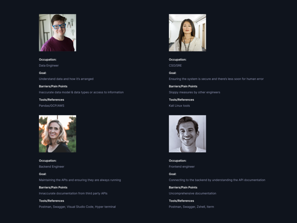
After interviewing a few developers I compressed the personas into four main groups as follows:

What we got right
- We were praised for our overall solution to the video streaming developer experience.
- Documentation: this particular issue has come up a few times with other products they have encountered, but they seem to be satisfied with ours so far, i.e. API routes, necessary parameters, description and what responses to expect(Among other developer gibberish).
Highlighted Problems
After taking into account the feedback from users who have used other API service providers and the 100ms dashboard, I have narrowed the problems to these 5 below:
- Documentation: this particular issue has come up a few times, so we will have to make our documentation more elaborate; i.e. Properly laying out the API routes, necessary parameters, description and what the response looks like.
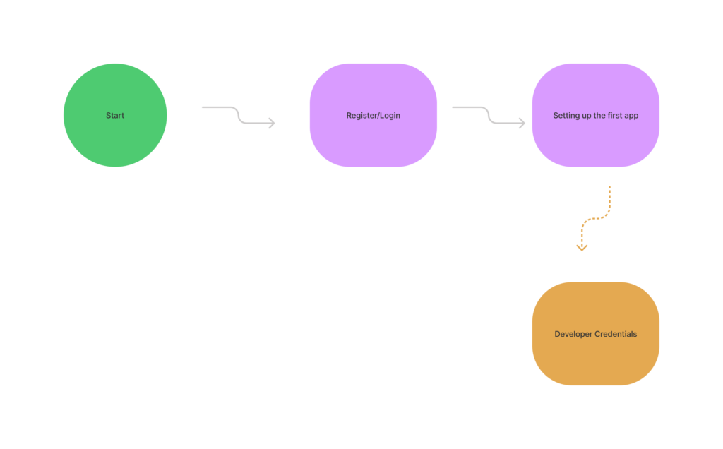
- No smooth/step-by-step onboarding process to successfully link and create their first app.
- Knowing the status of the API so they can carefully debug their APP or Website.
- Safeguarding API keys for security reasons and authentication for APIs.
- I didn’t know the SDK Documentation would open in another tab; I did the wrong things.
Suggested Solutions
- We will create a smooth and minimal onboarding process to get them through their first app.
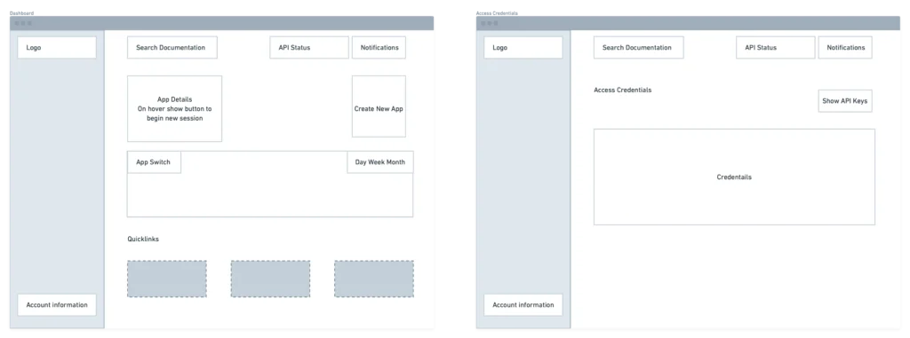
- We will make the Dashboard more elaborate so they can know the status of the system at all times.
- We will add a search bar so they easily search through the API documentation and access the help centre.
- We will also adjust the hierarchy of elements on the dashboard so they can focus on what matters.
- We will give them the ability to rearrange elements at will to suit their needs.
- Before API keys can be viewed, OTPs will be sent to the destination email or phone number for better security.
- Show days since the last downtime and how long it lasted.
- Let the developer know the API documentation will open in another tab
- Rename the “Developer” tab to “Credentials.”
- Show the frequency of requests by a particular app in the dashboard instead of opening the window in the new tab when clicked.
- User account management.
*Note, we will not be fixing all these in this current redesign.
User flow

Wireframing
We will be using the left pane of the signing/sign-up page to show some testimonials so our onboarding developers can see we have like minds on board that have chosen us as their desired API provider. This is similar to the companies we have added to our Landing Page’s Hero section(Disney & Facebook). Letting our users know top players use our services adds more confidence before fully onboarding them.
This is a marketing move, and that’s part of the things we need to consider in our UX Design process; “Are we selling this the right way?” and other questions like that. Of course, the trade-off is removing all distractions from the. Sign Up process.
When the modal to create a project is active, we will reduce the background noise by adding an overlay that is a little bit blurry, just blurry enough to shift focus to the modal and away from the background so maybe 2–4px background blur.

High fidelity designs


Prototype
And the final result...
Notes
A lot of the visual style from the original 100ms was retained because this was mostly a UX Design Process and less focus on the UI.
I also wanted to make a point about how designers do not always have the answers and how some case studies can feel disjointed and you read through.
Credits
Dulanjali Madhushani, Product Designer
Sadiq Aderinto, Data Engineer @ Quidax
Boluwatife Owoade, Production Engineer @ Meta
