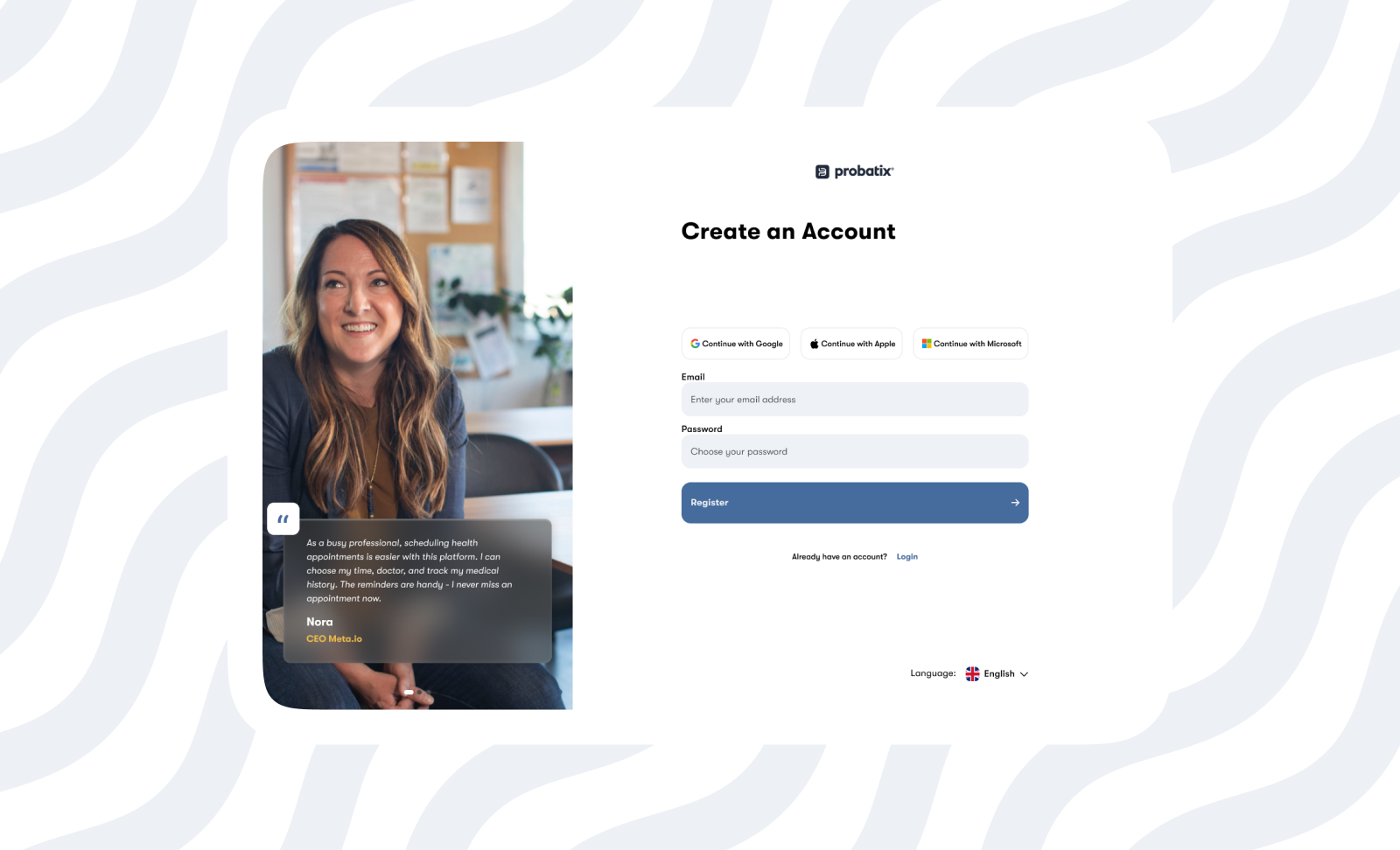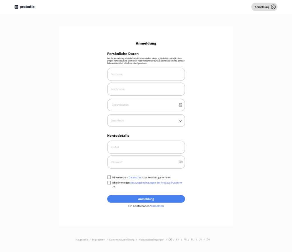
Presently this is what the signup page for Probatix looks like. Not bad pretty simple. Now let’s carefully dissect this from what it is to what it can be and why that is better.
Questions
- Who are the Users that have more problems registering?
- What can we do to increase the user-friendliness of the flow?
- Why is your solution better?
- How do we make sure this is the right decision?
Answers
Who are the users that have more problems registering?
To begin, we have to look at the current form as a whole and figure out what can be better. By simply attempting to use the platform and using my professional judgement by being empathetic, I can say non-tech savvy users and users with a disability will have problems using the website. And if we are to mention the unsuccessful delivery of the confirmation email, I will say all users; seeing as those with fast internet and are more patience wouldn’t be allowed in. At first glance, the form seems small and empty, but everything is not in view for some reason. There are only six fields, yet you have to scroll to see the rest of it, and it’s not in favour of hierarchy — A lot of space was used in the wrong places. The registration form fails to adhere to Web Content Accessibility Guidelines, we will be resolving some of these as we move forward.
What can we do to increase the user-friendliness of the flow, and why is your solution better?
As we aren’t privileged to have information specific to the platform, we will approach this audit from a broad point of view and cast a wide net using information that has worked in similar scenarios.
When onboarding a user, you have to shed away as much pain from the onboarding process as possible. It’s no news that authentication is the bane of conversion & user acquisition; just ask anyone. Take this study, for example, on how 43% of users abandon an onboarding process due to friction, so we have to put in a few steps to make this painless. If you ask me, I’ll take it out all-together and take the e-commerce approach of leaving it aside until the user needs value from the platform(i.e. book an appointment etc.).
Continuing to add more options for a user to sign up instead of just filling a form and creating a password will ease onboarding and improve security, as password theft is a growing concern; you have achieved all these with fewer resources. After this, for a returning user, we can collect the necessary details Name, email, and date of birth. You also save the extra hassle of verifying ownership of this email with the confirmation email or its delivery to spam or delivery at all. Also, after more than 12 hours of waiting, the email was never delivered, and there was no way to resend the email because I can only be allowed into the system once I verify this email. Auth0(a developer toolbox) is a great way to implement this as it’s developer friendly and has stood the test of time.
To summarize:
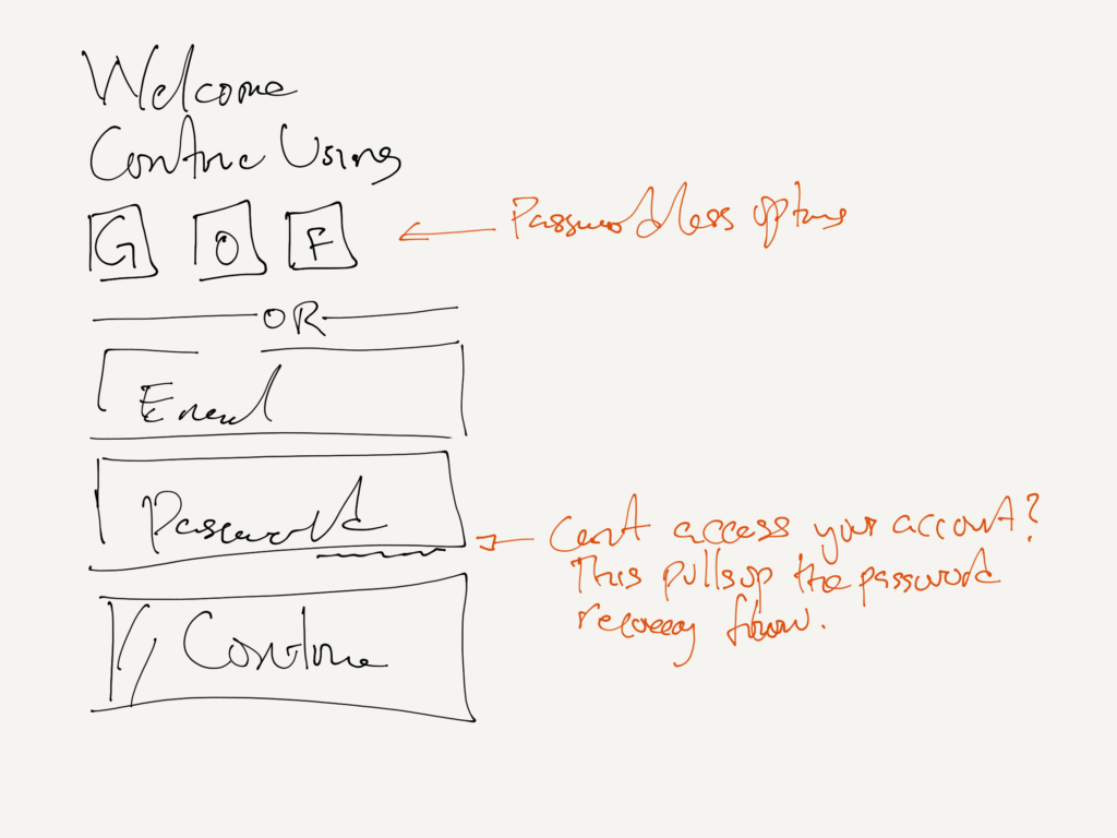
- We are using convenient ‘passwordless’ methods, Google, Outlook, and perhaps for the older generation, Facebook.
- Flags can help quickly identify what language and region instead of just text. The text should be a helper and not stand alone as a cue.
- Should the user not want to use any of the available passwordless options, the password option is also open to the user seamlessly.
Using all that information we previously know and have gathered, we will create a new user flow for the user.
User flow
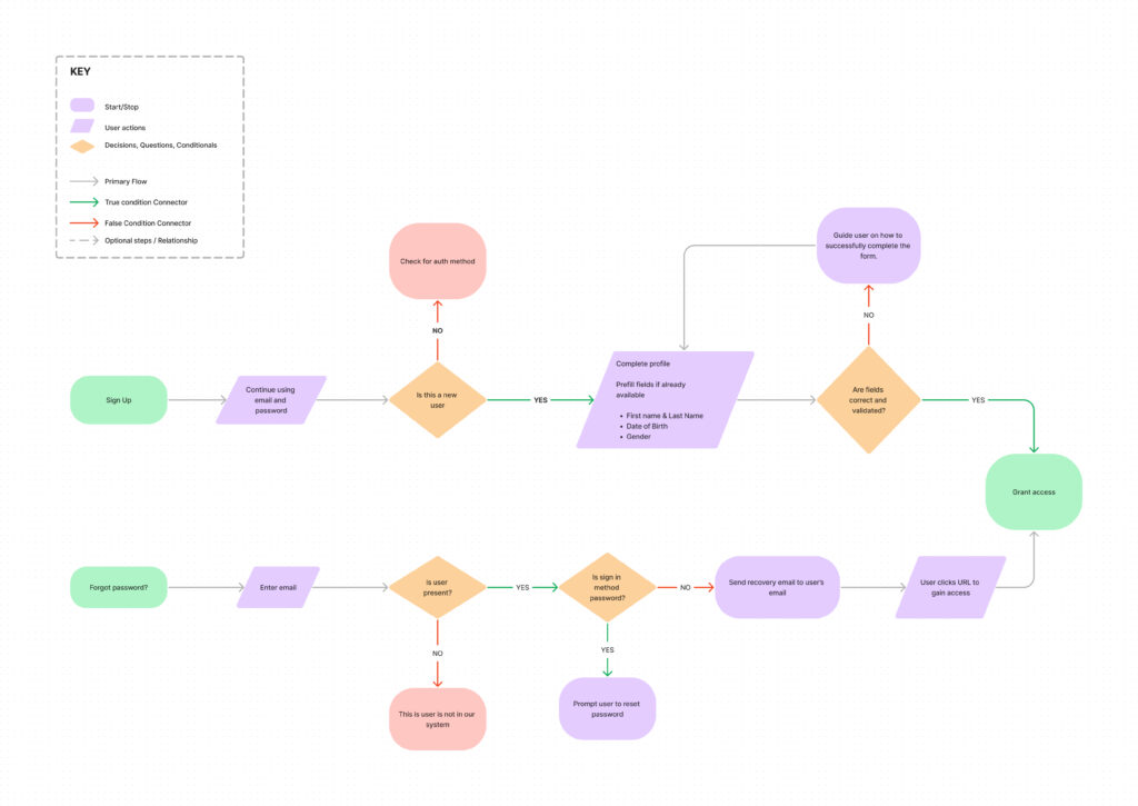
From the diagram above, we have done the heavy lifting/hard work and accounted for several scenarios to put less burden on the user. In all aspects, the user only has to take two actions, and we have an extra to spare if we are to cite the rule of threes.
Beyond the myriad of data and studies, we must know and test whether this works. We will use Maze for this test for ease of use and access to testers.
Wireframes
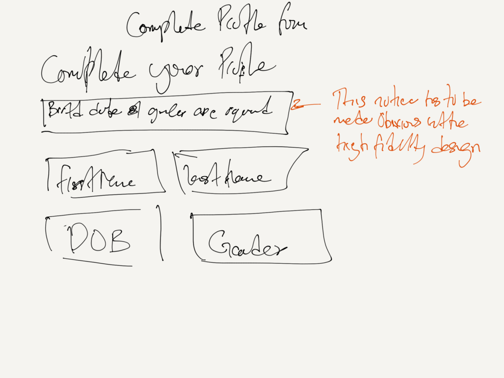
This is more internal, so I wouldn’t stress too much about it. We need a wireframe as a reference to know what elements to use and where. They are breadcrumbs to find your steps back in case you choose to make changes. Now let us sketch out an amalgamation of our ideas so far so we can understand how to represent this visually.
High Fidelity Design
You want to avoid using stock photos because you will want to communicate originality; you cannot do that with stock photos because anyone with $20 and a credit card can have access to them.
You want to keep the form on the right and the other information on the left because eye tracking in an F- shaped format starts from the right, so you have the user's attention on the important elements from the start. How do we know? A study by Nielsen Norman Group (2010), a world leader in research-based user experience, showed that users' reading and scanning behaviours usually follow an "F" pattern. They typically start in the upper left corner and scan horizontally to the right, then down, and a shorter scan to the right again. This pattern suggests that if your signup form is on the left, it may initially receive more attention, particularly from Western users; this pattern varies between regions, so we can consider that as we expand. More can be found here.
Splitting the form from one clunky form to two(authentication & complete profile), reduces the overload on one screen and gives the interface more screen real estate to do more. You also have the testimonial section that’s not too jarring and serves the purpose of convincing while being subtle and doesn't get in the way of onboarding the user.
The choice of the typeface “GT Walsheim Pro” is no accident. It is a geometry-type face and has multi-language support. This means the characters are derived from nearly perfect shapes, making them accessible to the eye while supporting languages from different regions.
To capture more people, we have to add flags to the entire language names on the language selector, as abbreviations alone aren’t intuitive. We expect an older demographic to use our platform, so we must make accessibility decisions to account for them. This platform will be visited multiple times, so you don’t want to make things too flashy to avoid getting old and distracting because it will be relaxing to the eye.
And, of course, let’s not forget legal and data protection consent.
All these will now be beautifully represented in a harmonious display below(Best opened externally):
Finally
How do we make sure this is the right decision?
Attached is a report from a five-tester group using the Maze platform. Kindly go through the slides.
The website performed as expected. To quote Jakob’s law, users spend most of their time on other sites. This means that users prefer your site to work the way they know. Simply put, keep things within the scope of the user’s mental model. Our solution delivers on that account successfully. The pool was small, but we can get better with each iteration.
Footnotes
An entirely different approach will be to give users some value without having them sign up or have an account. This will make it easy for users to discover the value of the platform and then to sign up when they have to make appointments or any action that requires account creation. E-commerce websites and numerous platforms utilise this.
Apps used
- Figma
- Paper by Dropbox
- FigJam
- Maze
- And, of course, my genius brain😅
Thank you very much for reading.
